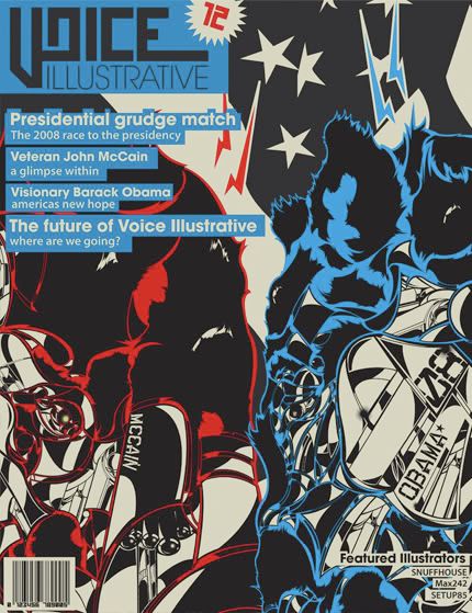
Im james A.K.A snuffhouse, keith asked me to post some works on here, im a student in Orlando for digital media and i need some advice on this cover page for a small mock up mag we have to make this month based on the Obama and McCain race, this cover is what i have done thus far and if anyone has some tips or suggestions please let me know.
5 comments:
Good shit, mang...I have no idea what I'm looking at, but it looks cool!
It's great abstract!!! I think it fits the 2008 presidency, think about it for a moment, eh? The work is swirled togehter, abstarctly, red vs. blue simplicity, then BAM! Confusion sets in, "What am I looking at or better yet, What is this about?! I believe most of us who actually vote would feel the campaign between those too juggarnauts is just as confusing as the beauty of abstract art. Great graphics dude:)
I wouldn't change a thing.
BERTIUS
Don't know where your experience falls, but I feel like I can give some appropriate advice on this since I've been in advertising for more than 3 years now.
In illustration or graphic design you can get away with things looking cool. In fact it's a plus.
Advertising is very different though. The most important thing in this medium is you must, MUST, communicate your message effectively. With a cover, this rule applies 100 times over. If the latter is done it's perceived as amateur and depending on the company it could mean your job.
Hope this helps.
Nice abstract cover design and welcome to the board the only thing I would of like to have seen different is obama's and mccanes names more prominent other than that THIS KICKS MASSIVE BUM the two designs mash against each over showing battle and conflict and the flag incorporated in the icing on the cake....Jawesome
Post a Comment